Modal Window I
Prompt
Modals are one of the most common UI patterns you will encounter during a frontend interview. From confirmation dialogs and login forms to full-screen media viewers, nearly every product ships some version of a modal window.
Your task is to build a Modal Window component in React. The modal should open when the user clicks a trigger button, render a dark backdrop behind the content, and close when the user clicks either the backdrop or a dedicated close ("X") button.
While this challenge may sound simple on the surface, there are a few subtle details around state management, portals, and event bubbling that interviewers love to probe. We will walk through each of them carefully so you can reason through the tradeoffs during your own interview.
Requirements
- Clicking a trigger button should open the modal
- Show a dark backdrop behind the modal while it is open
- Clicking the backdrop should close the modal
- A close ("X") button inside the modal should also close it
Example
Playground
You will need a single piece of boolean state to track whether the modal is open or closed. Use React.useState for this.
const [isOpen, setIsOpen] = React.useState(false);Use ReactDOM.createPortal to render the modal outside the normal DOM tree. This avoids z-index stacking issues when the modal's parent has overflow: hidden, transform, or a lower z-index.
import { createPortal } from 'react-dom';createPortal(<div>Modal</div>, document.body);Clicking the modal content should not close the modal even though it sits inside the backdrop. Stop the click event from bubbling up to the backdrop using event.stopPropagation() on the modal content.
<div className="modal" onClick={(e) => e.stopPropagation()}> ...</div>Solution
Explanation
I will walk you through this challenge step by step, the same way you would solve it in an actual interview. We will discuss not just the code, but also the reasoning behind each decision, the common mistakes candidates make, and what interviewers look for when they decide between a "No", "Yes" and "Strong Yes".
Before writing any code, always read the prompt thoroughly and confirm your understanding with the interviewer. A modal sounds simple, but the prompt here has a few non-obvious requirements: clicking the backdrop closes it, but clicking the modal itself does not. These small details often decide whether your solution is rated as complete.
Let's start solving.
Managing the Open / Closed State
The first thing we need is a way to represent whether the modal is open or closed. A boolean piece of state is perfect for this because the modal has exactly two states.
App.js
import React from 'react';import './styles.css';export default function App() { const [isOpen, setIsOpen] = React.useState(false); return ( <main className="wrapper"> <button className="open-button" onClick={() => setIsOpen(true)} > Open Modal </button> </main> );}We initialise isOpen to false because the modal should be closed by default. Clicking the trigger button calls setIsOpen(true) which flips the state to open.
Naming Boolean State
I always prefix boolean variables with is (or has / can / should): isOpen, isLoading, hasError, canEdit. It reads like a question the rest of the code can answer: "is open?" → "yes".
This is the industry-standard convention: when another engineer sees a name starting with is, has, can, or should, they expect a boolean. That expectation is so strong that using these prefixes for anything else is considered bad coding style. An isUser that holds a user object, or an isOpen that holds a string, will confuse every reader and invite bugs.
Without the prefix, names like open or modal are ambiguous. A reader has to pause and check whether the variable holds a boolean, a function, or a DOM element. Interviewers notice this kind of discipline; it is a small detail readers will appreciate.
Why a Boolean?
A boolean state is enough here because there are only two states: open or closed. Some candidates reach for a string state like 'open' | 'closed' or even a full state machine, which is overkill for a simple modal. Use the simplest state shape that models the problem.
Creating the Modal Component
Now we need a Modal component. A good rule of thumb in interviews is to reach for component extraction early. If you try to inline everything into App.js, you will end up with a tangled JSX tree and no time to refactor.
components/Modal.js
import React from 'react';import { createPortal } from 'react-dom';export default function Modal({ onClose, children }) { return createPortal( <div className="backdrop" onClick={onClose}> <div className="modal" onClick={(e) => e.stopPropagation()} > <button className="close-button" onClick={onClose} aria-label="Close modal" > × </button> {children} </div> </div>, document.body );}There are three important decisions in this component that are worth calling out explicitly in your interview:
- We accept
onCloseandchildrenas props. The modal does not own its open state; the parent does. This makes the modal reusable; any parent can decide when to show it and what content goes inside. - We render through
createPortalintodocument.body. This is the most important line of the solution. We will explain why below. - We stop propagation on the modal content. The backdrop and the modal sit inside the same wrapper, so a click on the modal would otherwise bubble up to the backdrop and close the modal.
Why `createPortal`?
Rendering a modal into document.body avoids many layout bugs. If a parent element has overflow: hidden, transform, filter, or a low z-index, the modal can get clipped, repositioned, or hidden behind other content. Portals break out of the parent's stacking context and render the modal as a direct child of the body. This is the pattern every major UI library (Radix, Headless UI, Material UI) uses for modals, tooltips, and dropdowns.
Wiring the Modal into App
Now we bring the pieces together in App.js:
App.js
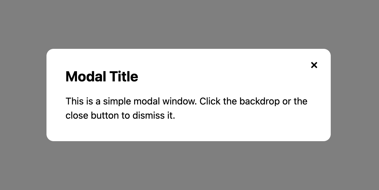
import React from 'react';import './styles.css';import Modal from './components/Modal';export default function App() { const [isOpen, setIsOpen] = React.useState(false); return ( <main className="wrapper"> <button className="open-button" onClick={() => setIsOpen(true)} > Open Modal </button> {isOpen && ( <Modal onClose={() => setIsOpen(false)}> <h2>Modal Title</h2> <p> This is a simple modal window. Click the backdrop or the close button to dismiss it. </p> </Modal> )} </main> );}Notice the {isOpen && <Modal ... />} pattern. When isOpen is false, the Modal component is not rendered at all. This means it is fully unmounted, which is usually what you want for a simple modal: no wasted DOM, no hidden elements, clean lifecycle.
Common Pitfalls
A very common mistake is always rendering the Modal and only toggling its visibility with a CSS class. This may seem cleaner, but it has real downsides:
- The modal's DOM stays in the tree even when hidden, which hurts accessibility; screen readers may still announce it.
- Any state inside the modal persists between opens, which can cause stale data bugs.
- Event listeners attached inside the modal continue to run even when the modal is not visible.
Handling Clicks: The Tricky Part
Let's dig deeper into the click handling because this is where most candidates slip up. Our JSX looks like this:
<div className="backdrop" onClick={onClose}> <div className="modal" onClick={(e) => e.stopPropagation()} > ... </div></div>Because of event bubbling, a click that starts on the modal (the inner div) bubbles up through its parent (the backdrop) before React's handler fires. If we did not stop propagation, every click inside the modal would trigger the backdrop's onClick and close the modal. The user would not be able to select text, click buttons, or interact with anything inside the modal.
Styling the Modal
Good styling does not require a ton of CSS. A few strong choices go a long way.
styles.css
:root { --color-primary: #e54d2e; --color-surface: #ffffff; --color-surface-muted: #f3f4f6; --color-border: #d1d5db; --color-backdrop: rgba(0, 0, 0, 0.5);}*,*::before,*::after { box-sizing: border-box;}body { margin: 0; padding: 0; color: black;}:focus-visible { outline: 2px solid var(--color-primary); outline-offset: 2px;}.wrapper { display: flex; justify-content: center; align-items: center; min-height: 100vh; padding: 24px;}.open-button { padding: 12px 24px; font-size: 16px; border: none; border-radius: 8px; background-color: var(--color-primary); color: var(--color-surface); cursor: pointer;}.backdrop { position: fixed; inset: 0; background-color: var(--color-backdrop); display: flex; justify-content: center; align-items: center; padding: 16px; z-index: 1000;}.modal { position: relative; background-color: var(--color-surface); border-radius: 12px; padding: 32px; max-width: 480px; width: 100%;}.close-button { position: absolute; top: 12px; right: 12px; width: 32px; height: 32px; border: none; background: transparent; font-size: 24px; cursor: pointer; line-height: 1;}The starter file defines a small set of CSS custom properties at :root so you don't have to pause mid-interview to pick hex codes. Reach for var(--color-primary) or var(--color-surface) instead of scattering raw hex values through your stylesheet. Consistency is free, and the interviewer will notice.
Let's break down the key decisions:
box-sizing: border-box;is always the first rule I write in an interview. It makes padding and border part of the element's declared width and height, which keeps layouts predictable.- The backdrop uses
position: fixedwithinset: 0.inset: 0is a modern shorthand fortop: 0; right: 0; bottom: 0; left: 0;. It stretches the backdrop to cover the entire viewport. display: flexwithjustify-content: centerandalign-items: centeron the backdrop centers the modal both horizontally and vertically. This is a clean way to center a modal without usingtop: 50%; transform: translate(-50%, -50%).- The modal has
max-width: 480pxwithwidth: 100%. This means the modal is at most 480px wide on large screens, but shrinks on small screens. Combined with the backdrop'spadding: 16px, the modal never touches the viewport edges, which keeps it readable on mobile. - A high
z-index: 1000on the backdrop ensures the modal sits above all page content. Because we're rendering through a portal, this z-index is compared against other elements directly inside the body, which is exactly what we want.
Interview Tip: Show Your CSS Priorities
Interviewers care about how quickly you can produce clean, polished UI. Spending 10 minutes writing CSS reset rules is a red flag. Have a small set of defaults you reach for every time (box-sizing, flexbox centering, inset: 0) and apply them without thinking. This frees up your time for the interesting parts of the problem.
Communicating as You Code
Throughout the solution, keep narrating your decisions. Interviewers want to hear things like:
- "I am lifting the open state to
Appso the trigger button and the modal can both access it." - "I'm using
createPortalhere because otherwise a parent withoverflow: hiddencould clip the modal." - "I'm stopping propagation on the modal content so clicks inside don't bubble up and close it."
Candidates who explain their reasoning consistently outperform candidates who write the same code silently. Even if your code is perfect, an interviewer who can't follow your thought process will write you down as "hard to read".
Interviewer Criteria
HTML/CSS
Does my backdrop cover the entire viewport using
position: fixedandinset: 0?Is my modal vertically and horizontally centered using modern flexbox?
Did I apply a sensible
max-widthso the modal does not span the full width on large screens?Did I give the backdrop a high
z-indexso it sits above page content?
JavaScript
Did I stop event propagation on the modal content so clicks inside do not close the modal?
Are my event handlers clean and named predictably (
onClose,onOpen)?
React
Did I lift the
isOpenstate to the parent (App) so both the trigger and the modal can access it?Did I conditionally render the modal with
{isOpen && ...}instead of always rendering it and hiding it with CSS?Did I render the modal through
createPortalintodocument.body?Am I using
childrento compose arbitrary content into the modal, keeping it reusable?
Component Architecture
Did I extract the
Modalinto its own component instead of inlining everything inApp?Does my
Modalcomponent acceptonCloseas a prop rather than owning its own open state?Did I add an
aria-labelto the close button so assistive technology can identify it?
Time Checkpoints
- 10:00 AM
Interview starts 👥
- 10:03 AM
Prompt given by the interviewer
- 10:05 AM
Candidate reads prompt and asks clarifying questions
- 10:08 AM
Trigger button and isOpen state wired up
- 10:12 AM
Modal component created and rendered through createPortal
- 10:15 AM
Backdrop click and close button working
- 10:18 AM
Styling completed
- 10:20 AM
Discussion with interviewer