Spinner with CSS
Prompt
Your task is to create a spinner using CSS. You can use #6e56cf as a color for the spinner.
Loading spinners are essential UI elements that provide visual feedback to users during wait times, improving overall user experience by indicating that the system is processing their request.
Example
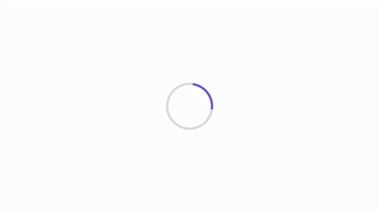
Note: The actual spinner will be animated with a smooth rotating motion, unlike this static image.
Playground
You can use the @keyframes rule to create the spinning effect.
@keyframes spin { to { transform: rotate(360deg); }}It can be used in the animation property of the element.
animation: spin 1s ease-in-out infinite;For the spinner appearance, you'll need to work with border properties. A common technique is to create a circle with a transparent or light border, but make one side (like the top border) more visible:
border: 4px solid rgba(0, 0, 0, 0.1);border-radius: 50%; /* Makes it a circle */border-top-color: #6e56cf; /* Makes just the top border visible */Solution
Explanation
Let's explore how our CSS spinner creates that satisfying loading animation you see on websites!
Basic Structure
Our spinner begins its life as nothing more than an empty div with a class of spinner. Nothing special yet.
<div class="spinner" aria-label="Loading"></div>First, we need to give our element some dimensions.
.spinner { width: 60px; height: 60px;}At this point, we have an invisible square of 60px by 60px. But spinners are typically circular, so we'll use border-radius: 50% to transform it to a circle.
The 50% value is magical because it consistently creates a perfect circle regardless of the element's dimensions.
.spinner { width: 60px; height: 60px; border-radius: 50%;}The border trick: Creating the spinning effect
.spinner { width: 60px; height: 60px; border-radius: 50%; border: 4px solid rgba(0, 0, 0, 0.1); border-top-color: #6e56cf;}What's happening here? We've given our circle a light gray border (rgba(0, 0, 0, 0.1)) all the way around. But then we override just the top portion with our purple color #6e56cf.
Think of it like a pie with one colored slice. That single slice is what creates the illusion of motion when we animate it!
Bringing it to life with animation
Now, we will make our circle spin!
.spinner { width: 60px; height: 60px; border-radius: 50%; border: 4px solid rgba(0, 0, 0, 0.1); border-top-color: #6e56cf; animation: spin 1s ease-in-out infinite;}@keyframes spin { to { transform: rotate(360deg); }}The animation property is like a mini instruction manual for how our element should move:
spin: The name of our animation (defined below)1s: How long each spin takesease-in-out: Gives a natural feel with gentle acceleration and decelerationinfinite: Keeps spinning until we tell it to stop
The @keyframes block defines what happens during the animation. Here, we're simply saying "start at the default position (0 degrees) and rotate to 360 degrees." Since we only define the ending point with to, CSS assumes we start at 0.
Each time it completes a cycle, it seamlessly loops back to the beginning thanks to infinite.
Accessibility and Browser Compatibility
We've added aria-label="Loading" to our spinner to ensure screen readers can announce the loading state to users with visual impairments.
Regarding browser compatibility, the CSS properties used in this spinner are well-supported in all modern browsers. However, for older browsers, you might consider adding vendor prefixes:
@-webkit-keyframes spin { /* For Safari */ to { -webkit-transform: rotate(360deg); }}